| Indicator | Numerator | Denominator | Interpretation |
|---|---|---|---|
| 1a | N of monthly facility reports received | Total N of facility reports expected (usually 12 × N of facilities with the service) | Reporting rates over 90% are good; changes in reporting completeness over time affects trend analysis |
| 1b | N of districts with at least 90% monthly reporting completeness in a year | Total N of districts | Can be used to identify districts with low reporting rates in multiple years |
| 1c | N of districts with no missing values for any of the 4 forms in a year | Total N of districts | Additional indicator, is not used to compute the overall data quality score |
| Statistics for 1a and 1b are based on the mean of 4 reporting forms (ANC, delivery, immunization, OPD) |
5 Numerators Assessment
5.1 Rationale, Approach and implementation
Rationale: Scientific basis for the analysis
Routinely reported health facility data are an important data source for health indicators at facility and population level. The data are reported by health facilities on events such as immunizations given, or live births attended. As with any data, quality is an issue. Data needs to be checked to consider completeness of reporting by health facilities, identify extreme outliers and internal consistency. A standard reporting method for data quality allows assessment of progress over time.
Approach: Description of analytical steps
The analysis of the monthly data by district for 2019-2024 is used to assess annual data quality using the following standard indicators: Reporting completeness, Outlier detection,Internal Consistency Data completeness, Ratios calculation, Overall quality score
Implementation: Conducting analysis in the Shiny App
5.2 DQA Metrics calculation and interpretation
5.2.1 Reporting Completeness
Within the Shiny App, you can select the indicator of interest, the reporting rate cutoff point (performance Threshold)- the default value has been set at 90% reporting rate.
You can also choose the level of you analysis (Admin Level (Regions) or District level). Below is an output for ANC reporting rate at THE Admin Level 1.
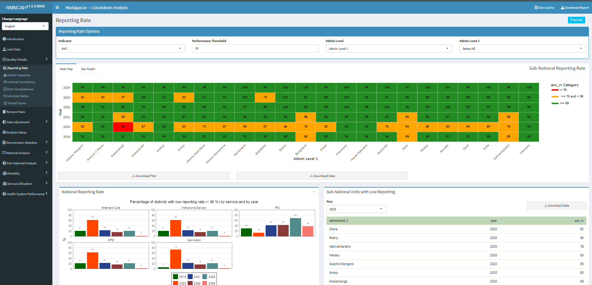
The app will automatically compute the overall data quality score based on the metrics described above. The app will also produce a report with the results of the data quality assessment, including the numerators and denominators for each indicator, as well as the overall data quality score. []
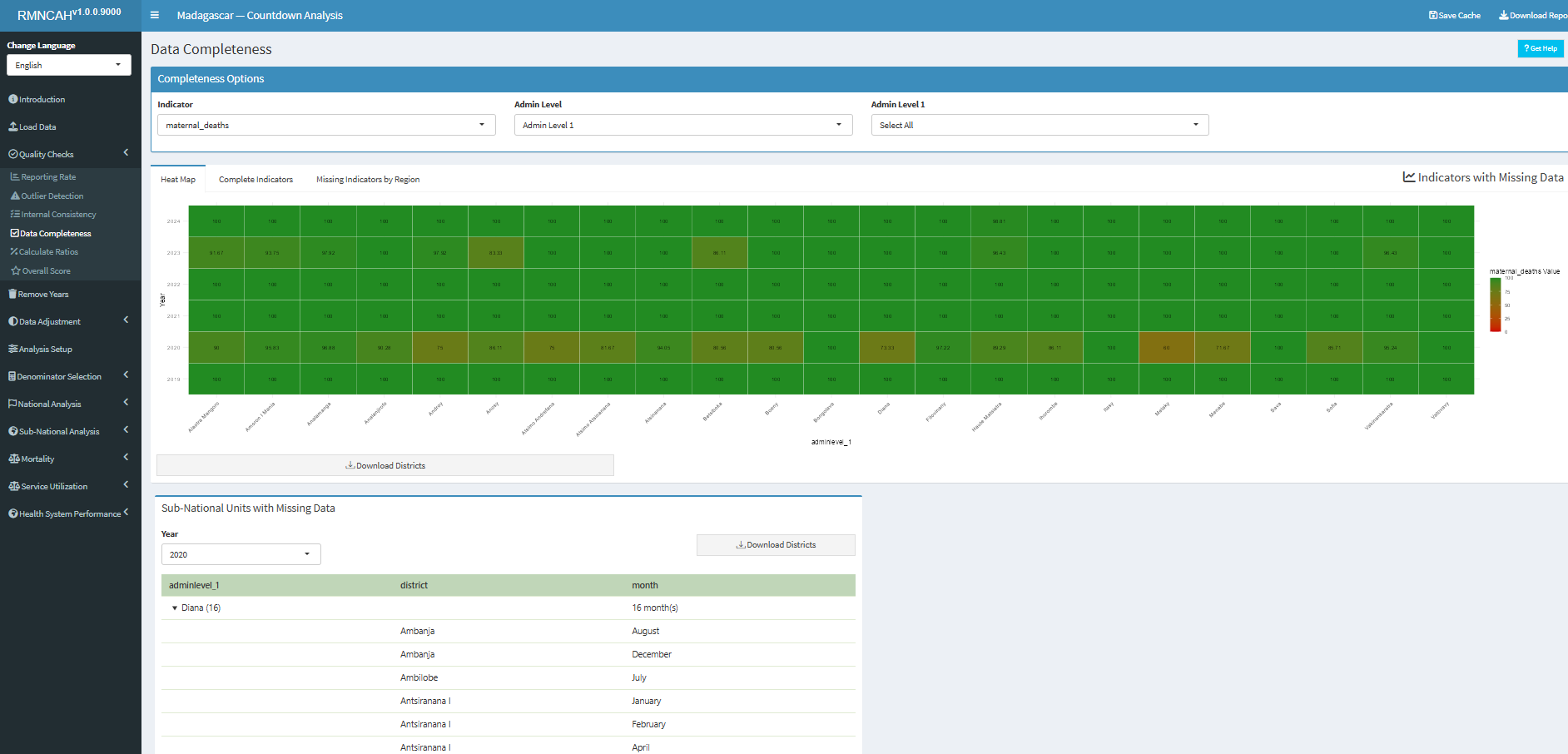
5.2.2 Data Completeness
5.2.3 Outlier Detection
| Indicator | Numerator | Denominator | Interpretation |
|---|---|---|---|
| 2a | N of monthly values that are not extreme outliers in a specific year | Total N of monthly values (usually 12 * N years to be analyzed) | At least 99% of monthly data expected not to be an extreme outlier; consider reasons |
| 2b | N of districts with no extreme outliers in a specific year | Total N of districts | At least 90% of districts should have no extreme outliers at all; consider reasons |
| Outliers are identified statistically; definitions may vary depending on methods used. |
5.2.4 Internal Consistency
| Indicator | Numerator | Denominator | Interpretation |
|---|---|---|---|
| 3a | N of ANC1 reported | N of penta1 reported | National ratio within an expected range (1.05 to 1.10 if survey coverage ANC1 and penta1 are the same – see below) |
| 3b | N of penta1 reported | N of penta3 reported | National ratio within an expected range, based on the survey results (see below) |
| 3c | N of districts with ratios within the expected range | Total N of districts | For districts there is more variation in the ratio: a wider range is considered |
| 3d | N of districts within the expected range | Total N of districts | For districts there is more variation in the ratio: a wider range is considered |
There is often an inconsistency between antenatal and immunization data, even though we can argue that the two should be consistent. To examine the association between ANC1 and penta1 is particularly informative.
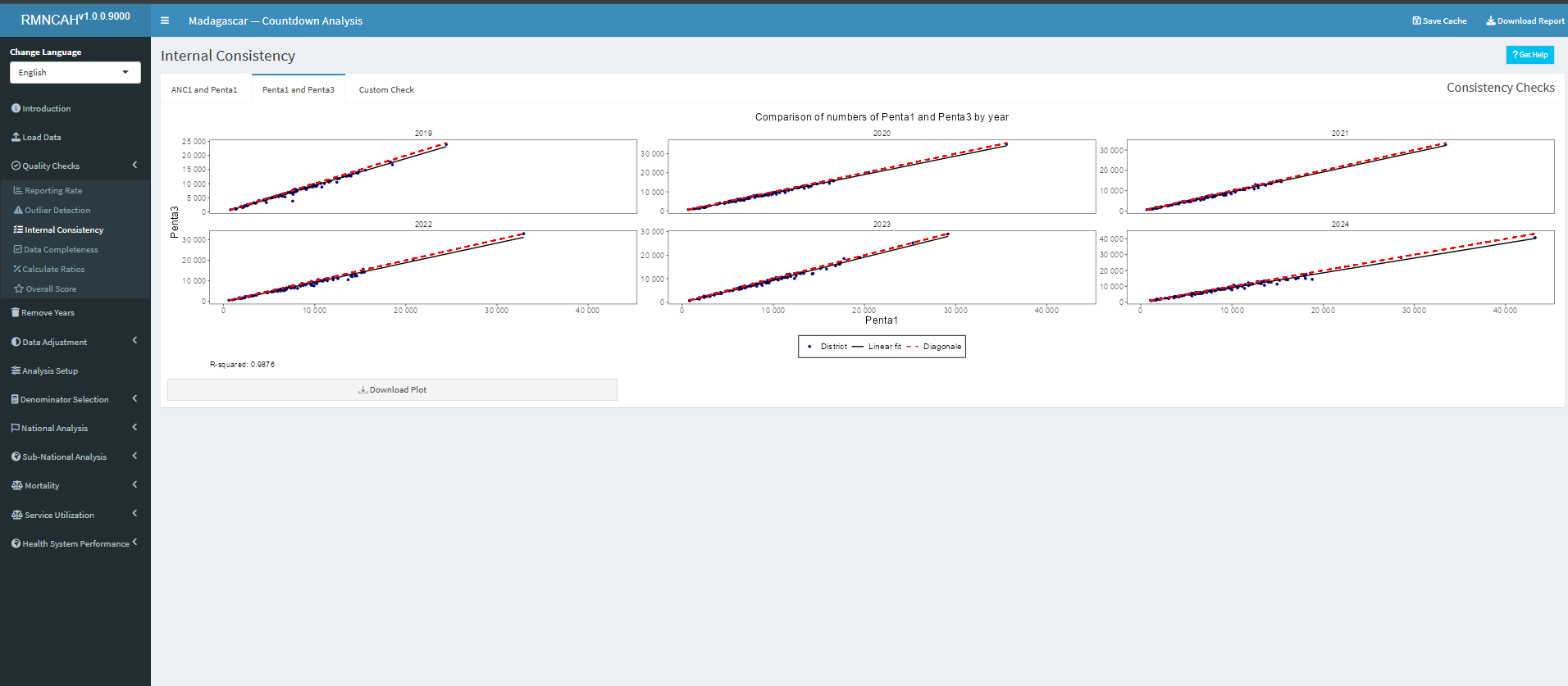
To compute and interpret indicators 3a and 3b the following considerations need to be made:
ANC1 to penta1 ratio
We can compute an expected ratio ANC1 to penta1 based on assumptions about mortality between early to mid pregnancy and early infancy and survey data on coverage of ANC1 and penta1 in the population:
-
Consider the mortality between the first ANC visit and the first pentavalent vaccination.
Assuming that ANC1 takes place at about 20 weeks or 4-5 months of pregnancy and penta1 at 6-8 weeks postpartum, we assume a pregnancy loss (abortion) after the ANC1 visit of 3%, a stillbirth rate of 2%, a twinning rate of 1.5% and neonatal mortality rate before the penta1 of 3% then the difference between the numbers of ANC1 and penta1 should be: \[1 - 0.03 -0.02 + 0.015 - 0.03 = 0.935 \] This corresponds with a ANC1 to penta1 ratio of \[1/0.935 = 1.07\]
-
Actual population coverage of ANC1 and penta1 will also need to be considered, using the surveys.
The expected ratio (the number of ANC1/ number of penta1 in facilities) is 1.07 * (ANC1 coverage in the survey/penta1 coverage in the survey). If coverage for ANC1 and penta1 are the same, then the ratio is \[ 1.07 (1.07 \times 1/1) \]
But if, for example, the last survey shows that ANC1 coverage was 90% and penta1 coverage was 95%, then the expected ratio becomes \1.07 * (.90/.95) = 1.01*.
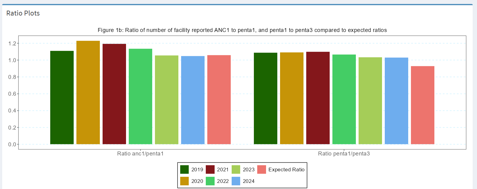
For the national ANC1 to penta1 ratio a range of plus or minus 0.05 outside this computed ratio is considered acceptable. If the ratio is outside this range, this should be flagged, and possible explanations discussed.
Penta1 to penta3 ratio
We can compute an expected penta1 to penta3 ratio based on the most recent survey:
The main factor determining the penta1 to penta3 ratio, which are recommended at 6 and at 14 weeks of age, is the actual drop-out rate between penta1 and penta3, as mortality plays a limited role.
Population coverage rates from the latest survey are used to determine the expected penta1 to penta3 ratio in the facility data. For instance, if penta1 coverage is 95% and penta3 coverage is 85%, we expect that ratio to be 0.95/0.85 = 1.12.
Also, here a range of plus or minus 0.05 is considered acceptable for the assessment of the facility data.
The Figure below produced in the ShinyApp shows the ratios for all six years (2019-2024) and the expected value. It will be important to reflect on large differences (e.g., more than 0.10 or 10%.).
5.2.5 Overall DQA Score
In this section, the overall DQA score is calculated by considering the mean scores within some preselected data quality metrics as below.
| Indicator | Numerator | Denominator | Interpretation |
|---|---|---|---|
| Annual data quality score (mean 1a, 1b, 2a, 2b, 3c, 3d) |
It is in this section that the first section report is downloaded capturing the key DQA indicators as shown below.
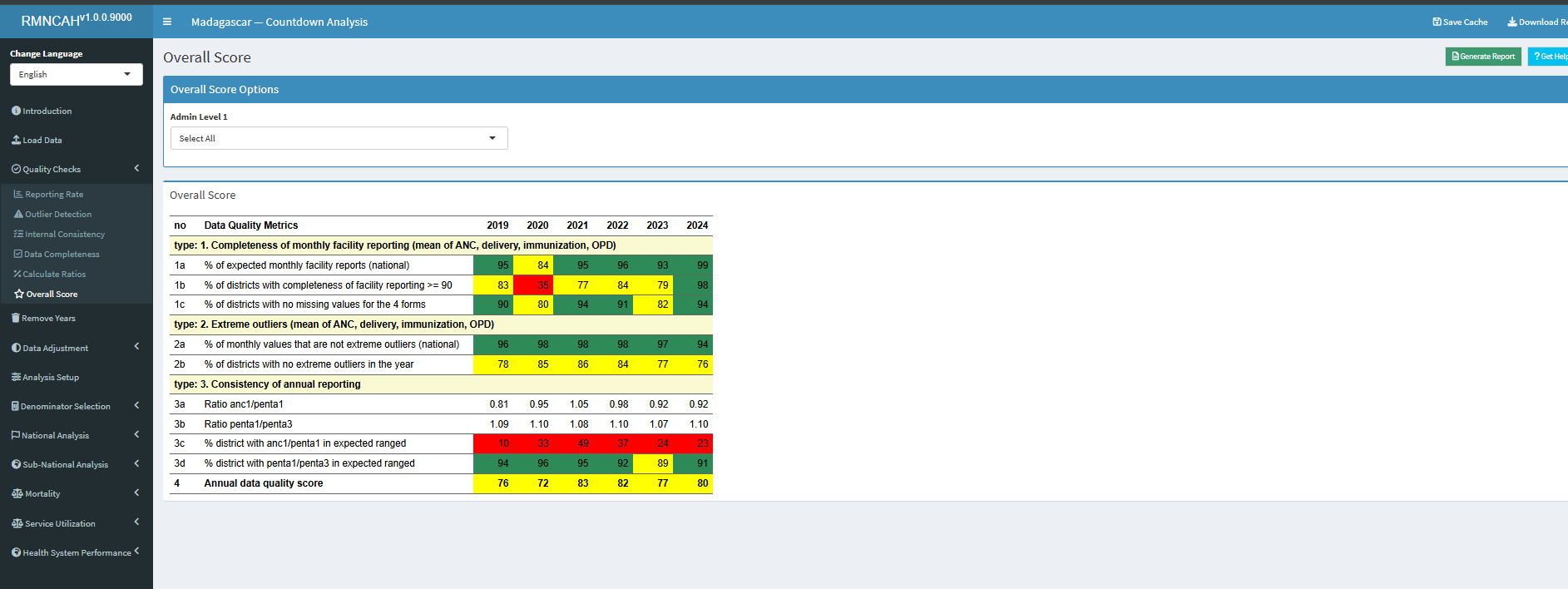
5.2.6 DQA Report and interpretation
The first report - DQA - is generated using the Generate Report button.
The interpretation for this section should seek to answer the following questions:
- Is there a data quality pattern by year for which there is an explanation? (include the explanation)
- Are there certain regions or other sub-national units that are particularly problematic?
- Are there certain reporting forms or services (e.g., antenatal care, labour and delivery, immunization) that are problematic?
- Is there good consistency between reported numbers of ANC1 and penta1?
¹ An extreme outlier is defined as a monthly value that is 5 times the median absolute deviation (MAD) from the monthly median value for a particular year.